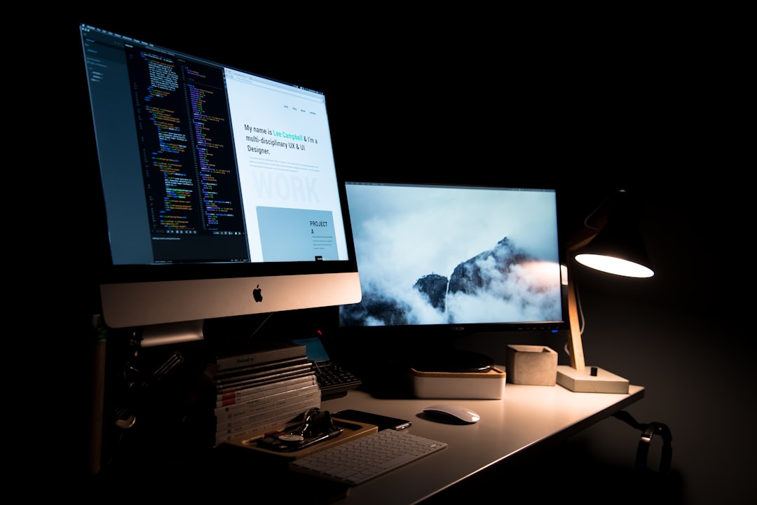
Aesthetic backgrounds can make a desktop or phone feel personal, but they are also practical design assets: the right wallpaper style helps icons stay readable, supports a consistent visual identity, and gives you a quick way to refresh your screen without redesigning everything from scratch. This monthly-style roundup is built to be useful over time. Instead of chasing one short-lived trend, it maps the aesthetic wallpaper styles that keep returning, explains where each works best, and shows how to choose, crop, and revisit them as seasons, devices, and visual tastes shift.
Overview
If you want a reliable shortlist of aesthetic backgrounds for both desktop wallpaper and phone wallpaper, this guide gives you a practical collection to come back to. The goal is not to name a single “best” look. It is to help you identify the styles that stay popular because they are adaptable, readable, and easy to match across screens.
The most useful aesthetic backgrounds usually do three things well:
- They create mood without competing with app icons or widgets.
- They scale cleanly across mobile and desktop formats.
- They stay visually relevant beyond one short trend cycle.
For that reason, the strongest recurring categories tend to be simple, flexible, and easy to customize. Below are the styles worth tracking in an updated monthly roundup.
1. Minimalist gradient backgrounds
Soft gradients remain one of the safest choices for a phone aesthetic background or desktop aesthetic wallpaper. They work because they add color and depth without visual noise. A clean gradient can feel calm, modern, dreamy, or energetic depending on the palette.
Best uses:
- Lock screens with widgets
- Desktop setups with many icons
- Tablet wallpapers
- Background images for light branding systems
What to look for:
- Gentle transitions instead of harsh banding
- Medium contrast rather than extremely bright centers
- Color pairs that suit the season or mood
If you want more palette direction, see Gradient Background Trends: Color Combinations Designers Still Use.
2. Grainy film and soft blur wallpapers
Grain overlays and blurred color fields have become a staple in aesthetic wallpaper collections. They feel tactile and digital at the same time. The blur keeps the composition unobtrusive, while the grain adds enough texture to avoid a flat screen.
These are especially good for people who want cute background images or mood-driven visuals without literal subjects like flowers, clouds, or city scenes.
Best uses:
- Phone home screens where app labels need space to breathe
- Desktop setups with a minimal dock layout
- Backgrounds that need to feel current but not loud
3. Nature-inspired calm aesthetics
Muted skies, soft waves, distant mountains, leaves, and close-cropped botanical scenes remain popular because they feel timeless. Nature-based aesthetic backgrounds are easy to revisit every month by adjusting color temperature: brighter in spring, warmer in autumn, darker in winter, lighter in summer.
Best uses:
- Phone lock screens
- Large desktop monitors where image quality matters
- Workspaces that need a less synthetic look
Choose images with negative space if you plan to place time, weather, or widget layers over them.
4. Abstract shape compositions
Abstract backgrounds are among the most versatile categories because they can feel playful, refined, retro, or futuristic. Rounded forms, cut-paper layering, floating shapes, and light shadow effects all translate well into wallpapers. They are also useful if you want a background image that feels designed rather than photographed.
For related ideas beyond wallpaper, visit Best Abstract Backgrounds for Posters, Thumbnails, and Digital Ads.
5. Paper, fabric, and tactile texture backgrounds
Texture backgrounds help screens feel less clinical. Subtle paper grain, folded paper, canvas, linen, or matte surfaces can create a warm visual base without overwhelming the layout. This style works particularly well for creators who prefer editorial, handmade, or scrapbook-inspired aesthetics.
Best uses:
- Neutral phone wallpapers
- Desktop wallpaper in creative or writing setups
- Mood boards and presentation background mockups
For a deeper look at tactile finishes, see Paper Texture Backgrounds: Which Finish Works Best for Each Design Project.
6. Marble and stone-inspired luxury neutrals
Marble texture backgrounds and soft stone patterns remain a recurring favorite in aesthetic wallpaper collections because they sit between minimalist and decorative. A white marble texture can feel clean and bright. Black marble feels more dramatic. Beige and warm stone tones create a softer premium look.
These styles are useful when you want a wallpaper that still feels polished in a professional context.
For color-specific guidance, read Marble Texture Backgrounds: When to Use White, Black, Gold, and Color Variants.
7. Retro digital and Y2K-inspired styles
Some monthly updates should include trend-driven styles, and retro digital looks are one of the recurring ones. Think chrome accents, neon glows, pixel stars, translucent interface shapes, or soft cyber pastels. These styles tend to cycle back with small changes in color and detail.
The key is moderation. A wallpaper can nod to a trend without becoming difficult to use every day. A toned-down version often lasts longer than a highly specific graphic reference.
8. Cute illustrated wallpaper
Cute background images continue to perform well, especially for personal devices. This can mean doodles, tiny icons, whimsical characters, repeating motifs, or pastel scenes. The most useful versions keep the composition airy so the wallpaper stays functional.
When choosing cute illustration wallpapers, avoid overly busy detail clusters in the center. They often disappear under icons on phone screens and feel cluttered on smaller devices.
9. Dark mode aesthetic backgrounds
Not every aesthetic wallpaper needs to be soft and bright. Deep charcoal, midnight blue, dark plum, and low-contrast black backgrounds are popular because they reduce glare and make screens feel calm. They also pair well with OLED displays and minimalist interface setups.
Good dark wallpapers still need tonal variation. A completely flat black image may look unfinished, while a gentle gradient, texture, or abstract shadow gives the screen more depth.
Maintenance cycle
To keep a roundup like this useful, update it on a simple schedule rather than rewriting it only when trends feel outdated. A monthly maintenance cycle works well because wallpaper interest is highly seasonal and often tied to device refreshes, interface changes, and mood-based searching.
A practical monthly cycle can look like this:
Week 1: Review style balance
Check whether the collection still reflects a healthy mix of looks. A strong roundup usually includes:
- At least one minimalist background option
- At least one texture-heavy option
- At least one abstract style
- At least one dark wallpaper option
- At least one seasonal or trend-responsive addition
If the roundup becomes too dominated by one style, such as pastel gradients or ultra-busy collages, it stops serving a wider audience.
Week 2: Refresh device relevance
Make sure the guidance still works across current screen habits. Readers looking for aesthetic backgrounds often need clarity on whether an image suits a phone wallpaper, desktop wallpaper, tablet screen, or ultrawide monitor.
Link out to sizing resources when needed, including Phone Wallpaper Sizes by Device: iPhone, Samsung, Pixel, and More and Desktop Wallpaper Sizes Guide: 1080p, 1440p, 4K, and Ultrawide.
Week 3: Add seasonal rotation
This is where the article earns repeat visits. Add a modest seasonal update rather than rebuilding the entire piece. For example:
- Spring: fresh greens, floral minimalism, sky gradients
- Summer: brighter color washes, coastal scenes, warm neutrals
- Autumn: amber tones, paper textures, earthy dark backgrounds
- Winter: cool blues, soft monochrome, low-light abstract backgrounds
Seasonal additions should feel optional, not mandatory. The evergreen base remains useful year-round.
Week 4: Trim weak performers
Retire styles that no longer feel practical. This does not mean removing every dated trend reference. It means cutting examples that have become too narrow, too busy, or too difficult to use on real devices.
As a rule, if a wallpaper style looks striking in a thumbnail but frustrating on a home screen, it belongs lower in the list or outside the roundup altogether.
Signals that require updates
You do not need to wait for the next scheduled review if the article starts drifting away from reader intent. These are the clearest signals that an update is needed sooner.
Search language changes
If readers begin looking less for “cute background images” and more for “minimalist aesthetic wallpaper” or “dark mode phone aesthetic background,” the framing should shift. The article can stay on the same core topic while adjusting examples, subheadings, and keyword emphasis to better match what readers are trying to find.
Device behavior changes
When more users rely on widgets, lock-screen layouts, or ultrawide monitors, wallpaper advice must respond. Some backgrounds that work beautifully on a plain home screen become poor choices when text overlays and app clusters cover the center.
This is also why image placement matters. A wallpaper designed for the middle of a poster background may fail as a phone wallpaper if the focal point sits behind the clock or notifications.
One style begins to dominate the category
Sometimes a single visual direction becomes unusually prominent for a period. That could be grainy gradients, collage textures, dreamy clouds, or dark abstract backgrounds. When that happens, the roundup should acknowledge it, but not let it crowd out durable alternatives.
The best monthly update adds trend context while protecting long-term usefulness.
Related use cases become more important
Readers who arrive looking for wallpapers often also need matching assets for wider branding use: Instagram background graphics, a presentation background, a YouTube background, or a Zoom background in the same visual style. If those adjacent needs become more obvious, add a short cross-format note and internal links.
Useful related reading includes Best Free Zoom Backgrounds for Work, School, and Events and YouTube Banner and Channel Art Size Guide With Safe Area Template.
Common issues
Even a well-curated collection of aesthetic backgrounds can become less useful if a few recurring problems are ignored. This section helps you avoid the most common ones.
Beautiful but unusable images
Some wallpaper images look strong in previews but fall apart in daily use. Common reasons include:
- Too much contrast behind icons
- Important details hidden by clocks or widgets
- Excessive sharpness that creates visual fatigue
- Busy collage elements that feel cluttered on smaller screens
Before saving a wallpaper, imagine real interface layers on top of it. The most effective aesthetic wallpaper is attractive before customization and still functional after customization.
Poor cropping across devices
A desktop aesthetic wallpaper may not translate well to a phone aspect ratio, and vice versa. Wide compositions often lose their focal point when cropped vertically. Tall illustrations may feel empty on desktop monitors.
When possible, look for wallpapers available in more than one crop or use editable background assets so you can reposition the visual center. If your goal is cohesive branding across devices, choose styles built from repeatable textures, gradients, or abstract shapes rather than one fixed photograph.
Overcommitting to a trend
It is easy to select a wallpaper that feels exciting for a week and tiring by the next month. Highly specific trend visuals can date quickly, especially if they rely on novelty rather than composition.
A better approach is to keep one trend-driven wallpaper in rotation and pair it with one or two stable options: a minimalist background, a neutral texture, or a dark abstract backup.
Ignoring color environment
A wallpaper does not exist alone. It sits behind icons, app badges, folders, browser chrome, widgets, and sometimes custom themes. If all of those elements clash with the wallpaper palette, even a strong image can feel messy.
This is why neutral backgrounds, muted color fields, and soft textures remain so dependable. They leave room for interface colors to do their work.
Choosing style without purpose
There is nothing wrong with picking a wallpaper purely because you like it, but practical selection usually leads to better long-term satisfaction. Ask what role the background is meant to play:
- Calm visual base for work?
- Personal mood board for a phone lock screen?
- Brand-consistent desktop setup?
- Seasonal refresh?
Your answer helps narrow the collection much faster than browsing endless categories.
For readers who prefer understated visuals, Minimalist Background Ideas for Presentations, Websites, and Social Posts offers a useful companion perspective.
When to revisit
If you want this roundup to stay useful, revisit it with intention rather than only when you are bored with your wallpaper. A simple review rhythm helps you keep your screens fresh without wasting time searching from scratch.
Revisit your aesthetic backgrounds when any of these apply:
- You changed devices or screen sizes.
- You added new widgets, shortcuts, or icon packs.
- The current wallpaper makes text or icons harder to read.
- The season changed and you want a subtle mood shift.
- Your personal or brand style has moved in a new direction.
- You need matching background images for social, web, or presentations.
A practical refresh process takes only a few minutes:
- Keep three wallpaper categories saved: one neutral, one seasonal, one trend-forward.
- Test each candidate on the actual device before committing.
- Check readability on both lock screen and home screen.
- Prefer HD backgrounds or 4K backgrounds for larger displays to avoid softness.
- If you work across formats, choose a style that can extend into design backgrounds for presentations, posters, or website background images.
That final point matters more than it may seem. Many readers start by looking for a phone wallpaper and later need a related poster background, flyer background, or background for graphic design work. Choosing a style family instead of a one-off image makes future design decisions easier. If that broader use case matters to you, see Best Website Background Images by Industry and Page Type for a more applied angle.
The most reliable monthly update strategy is simple: keep the core categories stable, swap in a few timely variations, and remove anything that no longer works on real screens. Done well, this turns a wallpaper roundup into a living collection of free backgrounds and design-ready ideas rather than a one-time list. Return to it monthly, at season changes, or whenever your device setup changes, and you will spend less time searching and more time using backgrounds that actually fit your screen and style.