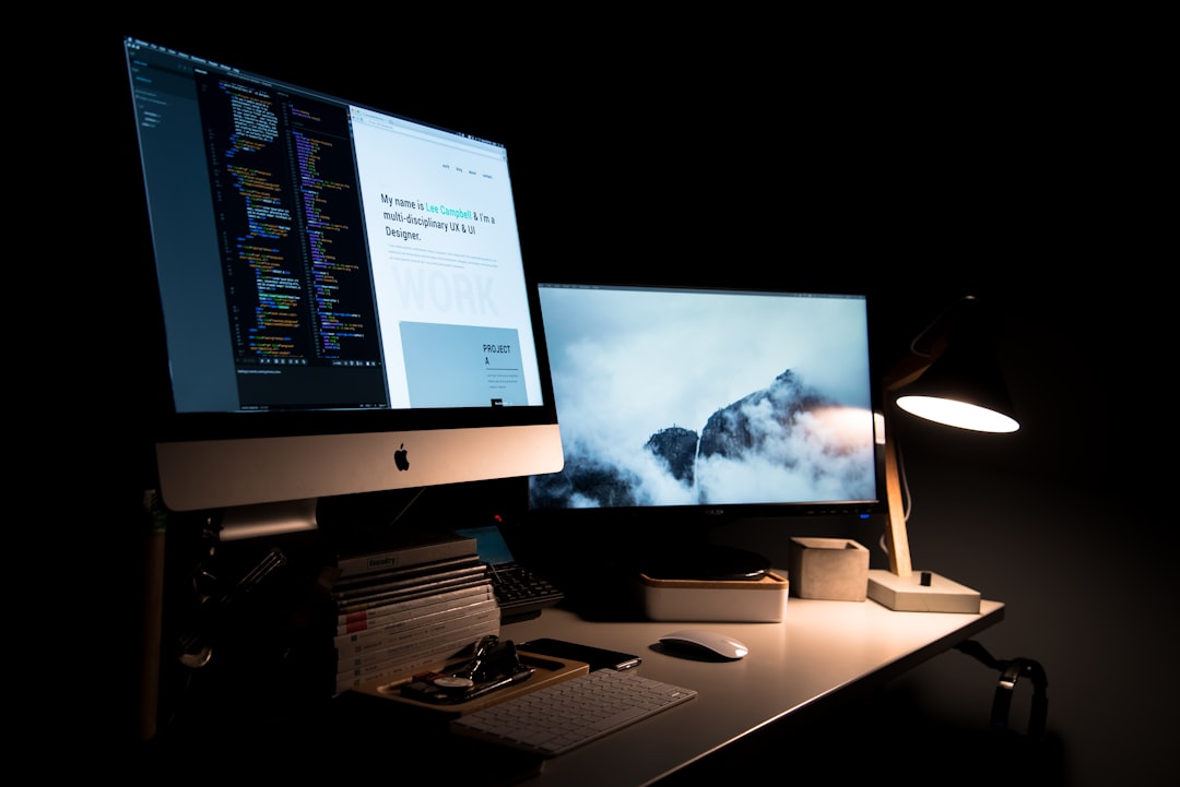
Use this background size guide as a practical preflight checklist for social posts, video graphics, websites, presentations, virtual meetings, and print. It covers useful canvas dimensions, aspect ratios, safe zones, export settings, and the checks that help prevent awkward cropping or unreadable text.
Overview
The right background size depends on two things: where the image will appear and how it will be used. A background designed for a phone screen has different priorities from a poster background or a full-width website hero. Start with the final placement, then choose the aspect ratio, working dimensions, resolution, and file format.
Dimensions are written as width × height in pixels for digital work and inches or millimetres for print. When a platform changes its display area or crops images differently, the safest approach is to check its current upload guidance and keep important content inside a central safe zone.
For general background design, work at the largest practical canvas you expect to need. You can usually scale a clean, high-resolution background down more reliably than enlarging a small one. This is especially important for gradients, paper textures, marble textures, photographic backgrounds, and detailed abstract backgrounds.
For more detail on responsive layouts and performance, see the website background size and performance guide. If you need a broader reference, the ultimate background size guide covers the same decisions across more use cases.
Checklist by scenario
Instagram backgrounds and social posts
- Square post: 1080 × 1080 pixels, a 1:1 ratio.
- Portrait post: 1080 × 1350 pixels, a 4:5 ratio. This gives a taller composition for feed-based designs.
- Story or vertical short-form graphic: 1080 × 1920 pixels, a 9:16 ratio.
- Safe zone: Keep headlines, logos, faces, and calls to action away from the top and bottom edges. Interface elements and cropping can vary by placement and device.
For an Instagram background, design the focal area before adding text. A subtle gradient background or low-detail texture gives typography more flexibility than a high-contrast photograph placed behind a headline.
YouTube backgrounds and video graphics
- Video background: 1920 × 1080 pixels for Full HD, a 16:9 ratio.
- Higher-resolution master: 3840 × 2160 pixels for a 4K working canvas when your source material and editing workflow support it.
- Thumbnail-style graphic: 1280 × 720 pixels is a useful 16:9 working size.
- Channel art: Use a wide canvas such as 2560 × 1440 pixels, and keep essential branding in the central area because channel art can display differently across screens.
Do not place important information close to the edges of a YouTube background. A background intended for video may be partially covered by titles, subtitles, controls, or a presenter. Use contrast and visual hierarchy to preserve separation between the subject and the backdrop.
Website background images
- Full-width hero background: Start with a 16:9 canvas such as 1920 × 1080 pixels for broad desktop coverage.
- Wide banner: A canvas around 1920 × 800 pixels can suit a shallow promotional area, provided the design remains usable at narrower widths.
- Repeating background: Build a small seamless pattern tile, such as 512 × 512 pixels or 1024 × 1024 pixels, when repetition is part of the design.
- Mobile check: Test a separate crop or responsive focal position rather than assuming the desktop composition will work on a narrow screen.
Website background images should support the content rather than compete with it. Consider a darker or lighter overlay, a restrained pattern, or a deliberately empty area behind navigation and headings. Export only as large as the layout requires; oversized files can slow page loading without improving the visible result. The guide to website background images offers additional composition and performance considerations.
Presentations and Zoom backgrounds
- Widescreen presentation: 1920 × 1080 pixels, a 16:9 ratio.
- Older or standard presentation format: 1024 × 768 pixels, a 4:3 ratio, when the presentation template requires it.
- Zoom or video-call background: 1920 × 1080 pixels is a practical starting canvas for a widescreen setup.
- Safe area: Leave clear space around the speaker’s head and shoulders, and avoid placing text where a camera feed or meeting interface may cover it.
For a presentation background, prioritize readability at a distance. Use low-detail abstract backgrounds, soft gradients, or lightly blurred photography. Test the design with a long title and a short title before finalizing it. For themed options, refer to the Zoom background collection.
Print backgrounds, posters, and flyers
- Choose the final physical size first: For example, an A4 page is 210 × 297 mm, while a US Letter page is 8.5 × 11 inches.
- Resolution: Use 300 pixels per inch as a common working target for detailed print artwork, unless the printer or production method specifies otherwise.
- Bleed: Extend the background beyond the trim edge when the printer requests bleed. A common setup is 3 mm or 0.125 inch on each edge, but confirm the printer’s specification.
- Safe margin: Keep text, logos, and essential details inside the trim line by a comfortable margin.
To estimate a pixel canvas for print, multiply the physical width and height in inches by the target pixels per inch. An 8.5 × 11 inch design at 300 pixels per inch is approximately 2550 × 3300 pixels before adding any required bleed. A print-ready background should also use the colour profile and PDF settings requested by the printer.
Phone and desktop wallpapers
- Phone wallpaper: Begin with a tall 9:16 canvas, such as 1440 × 2560 pixels, when the device dimensions are unknown.
- Desktop wallpaper: 1920 × 1080 pixels is a practical Full HD starting point; use 2560 × 1440 or 3840 × 2160 for higher-resolution displays when appropriate.
- Composition: Keep the most important subject away from common icon and clock areas, which vary by operating system and device.
What to double-check before export
- Aspect ratio: Confirm that the canvas matches the destination. Cropping a 16:9 background into a 9:16 placement can remove the intended focal point.
- Safe zones: Add temporary guides for browser controls, platform overlays, speaker video, logos, and trim edges.
- Text contrast: Check headings and small type against the background at the size people will actually see. A background contrast checker can help identify weak areas; see the contrast checker guide.
- Resolution: Make sure the source is large enough for the final output. Avoid enlarging a small background download until it becomes visibly soft or pixelated.
- File format: Use JPG for many photographic backgrounds, PNG when transparency or crisp graphic detail is needed, SVG for suitable vector artwork, and WebP when the destination supports it and file size matters. The background file format guide compares these choices.
- Colour mode: Keep digital work in an appropriate RGB workflow and prepare print files according to the printer’s colour requirements.
- Licensing: Confirm that a free background or texture is permitted for the intended personal, editorial, commercial, or client use. Keep a record of the asset source and licence.
Common mistakes
- Designing only for one screen: A background that looks balanced on a desktop may crop poorly on mobile. Preview the smallest and widest likely placements.
- Putting text on the edge: Cropping, interface controls, and printer trim can remove content that appears safe in the design file.
- Using a busy texture behind small type: Reduce contrast, blur the texture, add an overlay, or move the text to a quieter area.
- Confusing pixels with print size: A 1920-pixel image does not have one fixed physical size. Print dimensions depend on the chosen pixels-per-inch setting.
- Exporting only one version: Keep an editable master and create destination-specific exports for social, web, presentation, and print use.
- Ignoring file weight: A visually excellent website background can still be unsuitable if it is unnecessarily large. Compress a copy while retaining the original master.
When to revisit this guide
Return to this checklist before seasonal planning cycles, campaign launches, platform-specific content batches, and major website or presentation refreshes. Recheck the destination’s current specifications whenever a social network, video platform, design tool, or printer changes its upload or production workflow.
It is also worth revisiting your background library when your brand system changes. Update reusable templates with the correct logo clear space, type hierarchy, colour palette, and safe zones. Keep separate folders for editable background assets, web exports, social exports, and print-ready files so an old version is less likely to be reused.
Before acting, run this final sequence: identify the destination, select the aspect ratio, set the canvas, mark safe zones, place the focal subject, test text contrast, export the correct format, inspect the result at its intended size, and save the source file with a clear version name. That routine turns a general collection of backgrounds into dependable, reusable design resources.