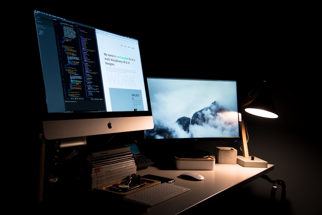
Choosing the right background image size prevents awkward cropping, blurry text, slow loading, and costly print corrections. This reusable guide covers practical dimensions, aspect ratios, resolution, formats, bleed, and safe zones for websites, social media, presentations, video calls, and print projects.
Overview
A background is more than a decorative layer. It may need to support readable text, preserve a logo, fill a responsive screen, or extend beyond a trimmed page. The best starting size depends on the final use, the way the asset will be viewed, and whether it will be edited later.
Use these four decisions before downloading or creating any background images:
- Identify the placement. A website hero, Instagram post, presentation background, poster, and phone wallpaper each use a different shape.
- Choose the aspect ratio. Wide backgrounds suit banners and slides; square and vertical backgrounds suit social posts and mobile screens.
- Set the working resolution. Digital graphics are usually planned in pixels. Print backgrounds should be planned in physical dimensions with a suitable pixel density.
- Protect the content area. Keep headlines, faces, logos, and important details away from edges and platform overlays.
For responsive website background images, do not assume that one fixed image will appear identically on every screen. A wide desktop composition may crop heavily on a phone. The subject should either remain near the visual center or be supplied in alternate crops. For more guidance on choosing and optimizing website background images, see the website background size and performance guide.
Checklist by scenario
Websites and landing pages
For a full-width hero background, begin with a wide image such as 1920 × 1080 pixels when the design is intended for large desktop displays. A 16:9 aspect ratio is a useful starting point, but the final container may be shorter or taller depending on the layout. For a banner with a shallow height, create a dedicated crop rather than forcing a standard HD background into the space.
- Use a composition that survives horizontal and vertical cropping.
- Leave a low-detail area behind navigation and headline text.
- Export a compressed WebP or JPG when transparency is unnecessary.
- Use PNG for transparency, sharp interface graphics, or limited-color artwork.
- Preview the background at desktop, tablet, and phone widths.
Backgrounds with large gradients, paper texture, marble texture, or abstract shapes can often be optimized effectively because they do not require every tiny detail to remain sharp. For additional examples, review best website background images for modern sites.
Social media posts and profile graphics
Social platforms use several image shapes, and their specifications can change. Before publishing, check the destination platform's current upload guidance. As a dependable planning system, prepare a master file in the intended ratio and keep essential content inside a central safe area.
- Square post: 1080 × 1080 pixels is a practical working canvas for a 1:1 design.
- Vertical post or story: 1080 × 1920 pixels is a useful 9:16 canvas for mobile-first content.
- Wide cover or header: use a wide canvas and test how profile elements or device crops overlap it.
- Carousel: keep every panel at the same dimensions and repeat the same internal margins.
For Instagram backgrounds, avoid placing small text close to the top or bottom of a vertical design. For LinkedIn, X, and other profile covers, preview the artwork with the profile image and interface overlays visible. The guide to backgrounds for profile covers can help with wide layouts.
Presentations and video calls
A presentation background is usually safest when built at 1920 × 1080 pixels for a 16:9 slide. Keep body text and important diagrams in the slide layout rather than baking them into a decorative background. A subtle gradient, minimalist background, or low-contrast texture is easier to read than a busy photograph.
For a Zoom background or other video-call backdrop, start with a 16:9 image at HD dimensions and test it with the camera, lighting, and intended crop. Avoid placing a logo where a speaker's head will appear. Fine patterns, narrow stripes, and detailed text can become distracting or difficult to reproduce on camera. Explore the free Zoom backgrounds by theme and resolution collection for layout ideas.
Phone and desktop wallpaper
Phone wallpaper should be designed vertically, but the exact screen ratio varies by device. A 9:16 canvas is a flexible starting point for a phone wallpaper, while a 16:9 canvas works for many desktop wallpaper concepts. If the image will be used across several devices, place the focal point near the center and keep the top and bottom areas relatively quiet.
- Use high-resolution source artwork so the image can be cropped without visible softness.
- Reserve space for icons, widgets, and lock-screen text.
- Check both lock-screen and home-screen crops.
- Prefer simple shapes, gradients, and textures when icons must remain easy to see.
Posters, flyers, and other print projects
Printable backgrounds should be set up at the finished physical size, commonly at 300 pixels per inch for detailed artwork unless the printer or production method specifies another setting. Add bleed when the background must run to the edge. A common working assumption is 3 millimetres on each side, but the printer's file requirements should take precedence.
For example, an A4 document with 3 millimetres of bleed on every edge is built at 216 × 303 millimetres rather than the trimmed 210 × 297 millimetres. At 300 pixels per inch, that working area is approximately 2551 × 3579 pixels. Treat this as a calculation example, not a universal production rule: confirm the printer's required bleed, color profile, crop marks, and file format before export.
A poster background can contain more detail than a flyer background, but both need a clear text zone. For packaging, mockups, and tactile-looking designs, fabric, canvas, and paper textures should be checked at actual size so the texture scale feels intentional. See fabric and canvas texture backgrounds for suitable applications.
What to double-check
Resolution and scaling
HD generally refers to a 1920 × 1080 pixel canvas, while 4K commonly refers to a canvas around 3840 × 2160 pixels. These labels describe pixel dimensions, not guaranteed image quality. A poorly scaled or heavily compressed 4K background may look worse than a well-prepared HD asset. Choose the smallest source that preserves the detail needed at the final viewing size.
Format and editability
Use JPG for photographic backgrounds and many full-color images where a smaller file is useful. Use PNG when transparency or crisp graphic edges matter. Use SVG for suitable vector artwork, icons, and scalable patterns. Use WebP for web delivery when your workflow and destination support it. A layered editable file is useful when text, colors, or texture opacity may change; a flattened background is simpler for final publishing. The background file format guide provides a fuller comparison.
Contrast, safe zones, and color
Place a temporary headline, logo, and call-to-action over the background before approving it. Check contrast at the size people will actually see, not only while zoomed in. A darker or lighter overlay can improve readability without replacing the image. Use the background contrast checker guide when text sits directly on an image.
Licensing and asset history
Keep a record of where each background came from, what modifications were made, and whether the intended use permits commercial publication. Do not assume that a free background automatically permits every use. Save the original download, license information, and final export together.
Common mistakes
- Using one crop everywhere: A desktop wallpaper, vertical story, and poster need different compositions.
- Designing at the wrong ratio: Stretching a square background into a banner distorts shapes and texture.
- Putting text near edges: Responsive layouts, social overlays, and printer trimming can remove it.
- Confusing pixel dimensions with print size: A large pixel count does not by itself define a physical output size.
- Exporting too early: Flattening an editable background before checking alternate sizes makes revisions harder.
- Ignoring file weight: An oversized website background can slow the page, while excessive compression creates visible artifacts.
- Skipping a real preview: Inspect the design on the target device, slide, browser width, or printed proof.
When to revisit
Return to this checklist before each seasonal planning cycle, campaign refresh, platform redesign, or major workflow change. Social and publishing platforms may adjust display areas, interface overlays, or upload recommendations, so verify current destination requirements before exporting a final asset. Recheck print specifications whenever the printer, paper, finishing method, or production size changes.
Use this quick final checklist:
- Confirm the final placement and aspect ratio.
- Set the correct pixel dimensions or physical print size.
- Add the required bleed and keep key content inside the safe zone.
- Choose the appropriate JPG, PNG, SVG, WebP, or editable format.
- Test cropping, text contrast, and file weight at the final viewing size.
- Save the source file, export, and licensing notes together.
- Preview once on the target screen or with a print proof before publishing.
When you treat dimensions as part of the design rather than a final technical step, free backgrounds, HD backgrounds, texture backgrounds, and editable background assets become easier to reuse across the web, social media, presentations, and print.