Apple’s new developer gallery has made one thing clear: Liquid Glass is no longer just a visual language, it’s a marketing opportunity. When an interface feels motion-responsive, reflective, and spatial, the challenge is not simply capturing a screenshot; it’s translating a dynamic experience into a static asset that still communicates clarity, trust, and product value. That is especially important for app developers, growth teams, and publishers creating promotional images for app stores, social feeds, landing pages, and press kits. If your visuals don’t explain what the UI does in under a second, the “wow” factor can become visual noise.
In this guide, we’ll break down how to plan, shoot, and polish app screenshots and social creatives that make Liquid Glass UI feel alive without sacrificing readability or accessibility. Along the way, we’ll connect this workflow to broader creator operations, from creator content pipelines and campaign continuity to visual narratives that hold attention. If you’re building a developer gallery or a high-converting launch kit, this is the practical playbook you need.
1) What Liquid Glass Actually Means in Promotional Design
Motion-responsive UI is a storytelling problem, not just a screenshot problem
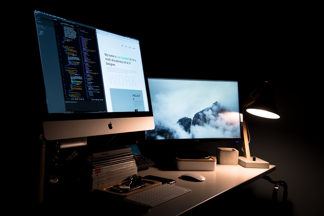
Liquid Glass aesthetics are about more than translucency. In a promotional context, they imply depth, layering, environmental response, and subtle movement that make the interface feel contextual rather than flat. That means your screenshots need to show state changes, layering hierarchy, and interaction cues, not just pretty panels floating over blurred backgrounds. The best app screenshots show the product in use, not just the product at rest.
This is why many teams fail: they treat app screenshots like catalog photos instead of product demos. A flat export of a screen may look elegant, but it often misses the point of motion-responsive UI. A well-designed creative should show the gesture, the reveal, the reaction, or the transition that makes Liquid Glass meaningful. That mindset is similar to choosing the right framing for live or fast-moving formats in real-time news ops or retention-driven streaming visuals, where clarity has to survive speed.
Why Apple’s developer gallery matters for marketers
Apple spotlighting third-party apps in a developer gallery signals a new standard for ecosystem presentation. It suggests that product teams should think in terms of curated showcases, not isolated assets. If Apple is rewarding apps that use Liquid Glass to create “natural, responsive experiences across Apple platforms,” then your creative should reinforce those qualities with the same level of polish and restraint. This is especially relevant for apps competing in crowded categories where design is part of the conversion argument.
For marketers, that means the gallery-style approach is a performance asset: it helps users instantly understand what the app does and why the UI feels premium. For developers, it’s a reminder that design systems need to be screenshot-ready long before launch day. Teams that build around campaign-ready workflows and rapid asset generation can move from prototype to press-ready much faster than teams assembling visuals ad hoc.
The promotional goal: visible clarity plus perceived motion
Your creative should accomplish two things at once. First, it must make the interface legible in a thumbnail, carousel card, or app store gallery. Second, it must imply movement, responsiveness, and refinement so the audience can feel the product quality before installing it. That balance is the heart of Liquid Glass marketing. If either side is missing, the asset underperforms: too much clarity and the interface looks generic; too much visual effect and the message becomes unreadable.
Pro Tip: Treat each visual as a miniature product demo. If a viewer can’t explain the feature after one glance, your motion or glass effect is overpowering the message.
2) Build a Screenshot System Before You Start Designing
Start with use cases, not graphics
Before you open your editing tool, list the exact jobs your screenshots must do. App store shots usually need feature explanation, while social creatives may need emotional punch, audience targeting, or event-driven urgency. A product launch page may need all three. Build a matrix that maps each asset to its purpose, audience, and format constraints so you are not making the same image serve incompatible goals.
This planning mentality is the same one used in analytics-native web teams, where outputs are designed around measurable actions rather than aesthetic guesses. It also resembles the discipline behind workflow-first content production—except here, the output is visual. In practice, a screenshot system should define what each frame is proving: “fast actions,” “natural transitions,” “customizable appearance,” or “cross-device consistency.”
Create a template family, not a single hero image
The strongest app marketing programs rarely rely on one perfect screenshot. They use a family of coordinated templates that can be repeated across iPhone, iPad, web, story, feed, and ad placements. This is where Liquid Glass design benefits from modularity: translucent cards, soft glows, and layered surfaces can be repositioned without losing identity. You want a system that can expand or compress based on placement while retaining visual coherence.
Teams that work from repeatable templates are usually faster and more consistent, much like brands that build structured creative around polished creator pipelines or campaign resilience. When you design this way, each screenshot slot becomes a variable in a system instead of a one-off art project. That makes testing easier, localization cleaner, and refreshes less expensive.
Lock in safe zones and readability rules early
Liquid Glass effects can fail when type sits on busy reflections or when controls blend into the background. Define safe zones for copy, logo placement, and call-to-action labels before you finalize art direction. Also define contrast thresholds for text overlays and icon visibility, especially if the asset will be repurposed for small screens. A good workflow uses a high-contrast baseline, then layers glass effects only where they support, rather than obscure, the message.
| Asset Type | Primary Goal | Best UI Treatment | Risk to Avoid | Recommended Format |
|---|---|---|---|---|
| App Store Screenshot | Explain one feature fast | Clean device frame, one focal panel, subtle motion cue | Too many UI layers | Portrait, 4:3-friendly crop |
| Instagram Feed Creative | Stop the scroll | Bold headline, one hero interaction, reflective accent | Low contrast text | 1:1 or 4:5 |
| Instagram Story / Reels Cover | Signal movement and novelty | Vertical hierarchy, animated-like framing, minimal copy | Overloaded screen | 9:16 |
| Landing Page Hero | Build premium perception | Larger device mockup, atmospheric glass background | Hero without proof | Wide desktop |
| Press Kit / Gallery Tile | Earn editorial attention | Editorial spacing, polished annotations, brand consistency | Template monotony | Varies by publication |
3) Design Templates That Make Liquid Glass Readable
The three-template method: feature, story, and proof
To market a motion-responsive UI, create three template types. The feature template explains a core capability, such as switching layouts or responding to context. The story template focuses on user experience, showing a person, task, or scenario that makes the interface feel useful. The proof template adds evidence: ratings, usage stats, testimonial snippets, or a before-and-after comparison. Together, these templates provide a full-funnel visual system instead of scattered promotional images.
A feature template is best for app store galleries because it foregrounds utility. A story template often performs best on social, where emotional hooks matter more. A proof template helps bridge the gap when the audience needs reassurance that the app is not just beautiful, but useful and trustworthy. This logic mirrors how creators combine trend monitoring with audience-friendly packaging, much like building editorial calendars from trend databases.
Make glass effects support hierarchy
Liquid Glass works best when the visual hierarchy is deliberate. Use blurred or translucent surfaces to group related controls, not to decorate every edge of the screen. Keep the most important action inside the sharpest, most contrast-rich zone. Put secondary information on lighter, softer panels, and reserve the most reflective accents for small moments that deserve attention, like a notification chip, a media card, or an interactive toggle.
Think of the interface as a stage set. The brightest light should fall on the actor, not the curtain. In promotional assets, that means headlines, action labels, and core features must be easy to parse even if the background is stylized. If you need inspiration for visual staging, it can help to study how creators curate moodboards and rich composition systems in moodboard packaging and how designers adapt narrative intent in historically sensitive campaigns.
Use motion cues without requiring animation
You can imply motion in a still image using compositional techniques: diagonal alignment, layered overlap, motion blur fragments, light streaks, and partial transitions. A finger hovering over a control, a panel mid-slide, or a layered card peeking from beneath another surface can all communicate responsiveness without being animated. This is especially useful for app screenshots because static galleries often need to imply dynamic behavior.
For social creatives, use motion cues to create the sensation of flow. A gradient trail, a bent reflection, or a sequence of panels can suggest the interface is alive. That same strategic framing appears in platform performance thinking, where movement must be balanced against infrastructure constraints. Here, the “constraint” is visual attention: you only get a second or two to make the motion legible.
4) Photography and Capture Tips for App Screenshots
Capture the right state, not the obvious state
For Liquid Glass UI, the most interesting screenshot is often not the landing screen. It is the in-between state: the open menu, the expanded control, the media scrubber in motion, or the contextual popover revealing itself. These moments are where the interface shows intelligence and responsiveness. If your app has transitions, capture frames that preserve the feeling of transformation.
That approach is similar to how strong editorial teams document active systems rather than finished artifacts. It also resembles how creators build trust in high-speed workflows like real-time publishing or support message triage. A screenshot should feel like a proof point, not a poster.
Control reflections, backgrounds, and device mockups
Liquid Glass can become illegible if the background competes with the foreground. Use controlled gradients, subtle textures, or very soft environmental lighting behind the device. If you are using a mockup, ensure the device frame does not distract from the screen. Minimal shadows and clean margins usually outperform cinematic clutter because the UI itself is already visually rich.
When you’re working with product photography-style composites, tiny details matter. A bright highlight crossing a key button can make it unreadable at thumbnail size. A noisy background can flatten the glass effect instead of enhancing it. It helps to treat app screenshot capture like technical product photography, where consistency, spacing, and clarity are as important as composition. If your team already uses structured asset workflows like collaborative creator production, bring that discipline here.
Batch test on real devices and real feeds
Design files lie; feeds do not. Always test screenshots on actual phones and in platform preview modes because the visual hierarchy changes at smaller sizes. A beautiful frame in Photoshop can turn muddy when compressed into an app store carousel or social ad. Create a review loop that checks thumbnails, dark mode, color blindness contrast, and compression artifacts before anything goes live.
This is where operational maturity pays off. Teams that know how to validate output across environments, like those planning around mature-audience content formats or multi-channel audience needs, tend to catch problems earlier. For Liquid Glass creatives, the most common issue is not design quality; it is platform mismatch.
5) Accessibility Rules That Keep Glass Beautiful and Usable
Contrast is the non-negotiable
Accessibility is not the opposite of aesthetics; it is the prerequisite for usable aesthetics. Text over glass needs enough contrast to remain readable even when compressed or viewed in poor lighting. That means using strong text colors, tested overlays, and restrained background complexity behind key words. If your composition requires viewers to squint, it is not premium—it is broken.
Build accessibility into your template rules. Set minimum contrast targets, avoid tiny type on semi-transparent layers, and test icon-only controls with captions or annotations. Use motion cues sparingly and never depend on motion alone to convey meaning. If a screenshot supports a feature page, include labels that explain the interaction, which is especially useful for audiences who may be browsing on low-visibility or older devices, a consideration echoed in designing for older audiences.
Make screenshots understandable without sound or animation
Social creatives and app store images often appear in silent environments and in rapid scroll contexts. Therefore, every image should work independently of audio, motion, or surrounding copy. Use short, specific captions and visual anchors such as device frames, numbered steps, or highlighted interface regions. If motion is part of the pitch, make it readable through still composition.
This principle is familiar to anyone who has worked in fast editorial systems where context can’t be assumed. It aligns with best practice in speed-plus-context publishing and in portfolio-level visual planning, where decisions depend on legibility at a glance. In practical terms, every screenshot should answer: What is this? Why does it matter? What should I do next?
Plan for localization and device variability
Some markets need longer text, different device shapes, or right-to-left layout support. If your Liquid Glass screens rely on tight spacing, localization can break the composition fast. Build text-safe regions and design variants with flexible type containers so translations do not overflow. Likewise, check that your translucent effects still read cleanly on OLED, LCD, and lower-brightness displays.
That level of planning is also useful if your app is promoted internationally or through cross-platform creator channels. Just as travel guidance content depends on jurisdiction-specific details, app creatives must adapt to platform and audience specifics. The result is a more durable asset library that can be reused across launches and refreshes.
6) Social Creative Formats That Amplify the Liquid Glass Effect
Carousel: teach the interface in sequence
Carousels are ideal for motion-responsive UI because they let you break the experience into steps. Slide one can introduce the problem, slide two can show the interface response, and slide three can show the result or benefit. This sequence builds comprehension while preserving curiosity, and it works especially well when the glass effect is subtle enough to reveal itself progressively. Think of it as a guided tour rather than a single poster.
Carousels also encourage intentional pacing, which is valuable when your product has nuanced transitions. They behave a bit like curated narratives in album art storytelling: each frame contributes to the whole without repeating the same message. Keep copy short and use each panel to reveal one new visual proof point.
Short-form video covers and motion posters
Even when you are not publishing full motion content, you can create “motion poster” assets that imply animation. These are especially helpful for Reels, TikTok, YouTube Shorts, and paid placements because they catch the eye with layered glass cards, subtle blur gradients, and a clear focal subject. When you can, pair these with a looping clip that shows the actual transition, but ensure the cover frame still works as a still image.
This approach is similar to how creator teams turn AI video workflows into reusable marketing assets. The key is that your cover should not be a random frame; it should be a designed composition with intentional spacing and hierarchy. If the motion is the hook, the cover must hint at it instantly.
Developer gallery assets and press-ready showcases
Apple-style gallery presentation is about editorial confidence. Use spacious layouts, restrained annotations, and a consistent framing system that makes each app feel selected rather than merely listed. Include concise copy that explains what makes the UI responsive or context-aware, and keep the visual field uncluttered. A developer gallery tile should feel like the best version of your product, not the most decorated one.
This kind of gallery thinking aligns with how brands stage launch-ready assets for press, partners, and marketplaces. It also benefits from disciplined creative operations, especially when teams are building cross-functional campaigns in the spirit of AI-first campaign planning. The more reusable your gallery system is, the easier it becomes to keep it current as the product evolves.
7) A Practical Workflow for App Developers and Marketers
Step 1: Define the UI moments worth showing
Start by identifying three to five moments that best express your product’s Liquid Glass behavior. These might include an expanding sheet, a smart filter, a live media card, an adaptive settings panel, or a context-sensitive toolbar. Each moment should have a business reason behind it, such as reducing friction, increasing delight, or differentiating the app from competitors. If a moment doesn’t help users understand the app, it does not belong in the gallery.
Teams that consistently win at visual marketing usually do this selection work early, the same way data-driven publishers prioritize the right inputs for trend calendars. If you need a framework for deciding which moments matter, look at how creators balance insight and output in trend-based content planning and how technical teams structure deliverables around clear thresholds in forecasting workflows.
Step 2: Design in layers
Build a base composition with the device, the screen, and the surrounding environment. Then layer your glass surfaces, highlights, and motion cues on top. Finally, add copy and conversion elements after the visual hierarchy is stable. This order matters because Liquid Glass effects can become hard to manage if the typography is added too early and forces awkward compositional decisions.
Layered design also makes versioning easier. You can swap backgrounds, update headlines, or localize screen text without rebuilding the whole creative from scratch. If your marketing team already uses systematic asset methods like those found in polished production workflows, this process will feel familiar and scalable.
Step 3: QA for clarity, compression, and consistency
Run a final quality check before publishing. Validate contrast, crop, device fit, headline length, and platform-specific safe areas. Then compress the image and check it again, because file degradation can soften edges, muddy translucent surfaces, and reduce readability. Consistency matters too: your screenshot set should feel like one coherent story, not five unrelated design experiments.
For larger teams, it can help to assign a reviewer from design, product, and growth so the final output balances beauty and business goals. This cross-check approach is similar to how resilient organizations manage content under change, whether in campaign operations or in tightly controlled publishing environments. The goal is not perfection; it is trustworthy presentation.
8) Mistakes That Make Liquid Glass Screenshots Fail
Over-styling the background
The biggest mistake is treating the background as a second hero. When the backdrop competes with the interface, the screenshot stops being a product demonstration and becomes a mood image. Keep the background supportive, not performative. A subtle gradient, soft light bloom, or restrained texture usually works better than a loud visual scene.
Another common issue is using too many glass layers at once. One or two well-placed translucent surfaces can suggest premium design, but six overlapping frosted panes often read as clutter. The best Liquid Glass creatives feel calm, not busy. Calm is what makes the interface feel advanced.
Writing copy that explains the obvious
If the screenshot already shows the feature, the copy should clarify the benefit, not repeat the UI label. Avoid generic phrases like “Beautiful design” or “Easy to use.” Instead, explain what the motion does for the user: faster scanning, less friction, clearer context, or quicker decisions. Good copy is a guide rail; weak copy is wallpaper.
This is where editorial discipline matters. Strong promotional writing, like strong product writing, should behave like a good caption: specific, useful, and memorable. If you need to sharpen that discipline, examine how creators turn niche expertise into compelling narrative in creator monetization or how publishers balance interpretive tone with speed in news operations.
Ignoring platform-native crops
A screenshot that looks amazing in a full-bleed design file may fail in the native crop of an app store, ad unit, or social preview card. Plan for safe margins from the start. If you need different versions, make them deliberately rather than letting the platform do the cropping for you. Platform-native optimization is not optional; it is how the image survives real-world distribution.
Just as teams adjust creative for channels, creators working across markets adapt to different audiences and feeds. Whether you are using a gallery, a feed post, or a press image, the design must meet the medium where it lives. That is the difference between a pretty file and a conversion asset.
9) Measuring Whether Your Visuals Actually Work
Track click-through, install intent, and completion rates
Once your Liquid Glass screenshots go live, measure more than vanity metrics. Track click-through rate, install conversion, gallery engagement, carousel completion, and save/share behavior where available. If a visual is aesthetic but not effective, these metrics will show it quickly. Treat your screenshot set like a living campaign, not a finished masterpiece.
Useful benchmarking also comes from comparing performance across versions: one with stronger contrast, one with more motion cues, and one with fewer decorative elements. Over time, you will learn which visual language best fits your audience and platform. This iterative approach is common in retention-focused content and in data-aware workflows like analytics-native design.
Listen for qualitative signals
Not every important result is numeric. Pay attention to comments, support questions, press pickup, and stakeholder feedback. If people keep asking what a visual means, the creative is not communicating clearly enough. If they say the UI looks premium but can’t identify what makes it different, the design is beautiful but strategically incomplete.
This kind of feedback loop is especially useful for teams that rely on public galleries or launch pages. The better your screenshots explain the product, the fewer explanatory burdens fall on sales, support, or app store copy. Think of it as lowering the friction between impression and understanding.
Refresh the library regularly
Liquid Glass aesthetics can date quickly if the creative system is not maintained. Refresh screenshots when major features change, new devices become important, or platform norms shift. Keep the source templates modular so the update cycle is fast and inexpensive. A gallery that feels current sends a stronger quality signal than one that looks frozen in launch week.
In creator and publisher workflows, maintaining a fresh asset library is part of staying discoverable. That is why ongoing curation matters in everything from event creative to fan ritual monetization. For app developers, the equivalent is keeping the visual story aligned with the product roadmap.
10) The Bottom Line: Liquid Glass Needs Editorial Discipline
Design for the glance, the scroll, and the install
Liquid Glass aesthetics can be a powerful differentiator when they are translated into clear, platform-optimized marketing assets. The winning formula is simple to say and hard to execute: show motion without losing readability, show polish without losing accessibility, and show complexity without making the product feel complicated. The screenshots and creatives that perform best are the ones that communicate value instantly while still feeling premium.
That balance is what Apple’s developer gallery is really signaling. The bar is no longer just “can the UI look good?” but “can the experience be understood, trusted, and desired through a single image or a short sequence?” If you can answer yes, your app screenshots become a sales tool instead of a decorative afterthought. That is the difference between being seen and being remembered.
Use a repeatable system, not a one-off design sprint
Build templates, establish rules, define safe zones, and review on real devices. Then keep iterating based on performance. The result is a creator-friendly asset workflow that works for developers, marketers, and publishers alike. It is the same long-game logic behind resilient content systems, from ops continuity to collaborative production, but applied to visual marketing.
And if you are curating a broader asset library, don’t stop at one article or one launch. Create a reusable visual playbook that your team can adapt for future features, seasonal campaigns, and platform updates. That is how Liquid Glass becomes not just a design trend, but a durable marketing advantage.
Pro Tip: If your screenshot set can survive shrinking to a thumbnail, translating to a social card, and still explaining the feature in one sentence, it is ready for launch.
Frequently Asked Questions
How do I make Liquid Glass app screenshots readable on small screens?
Use a strong focal point, reduce the number of visible UI layers, and keep text inside high-contrast areas. Test every screenshot at thumbnail size before publishing. If it becomes ambiguous when small, simplify the composition and remove decorative clutter.
Should app screenshots show motion or just imply it?
Both can work, but static screenshots usually need to imply motion rather than show it directly. You can use layered overlaps, transition states, and directional cues to suggest responsiveness. If you can use animated previews on platform, pair them with stills that clearly explain the same feature.
What’s the best screenshot format for Apple-style product galleries?
Use a clean, editorial layout with consistent device framing, restrained backgrounds, and concise annotations. The goal is to feel curated and trustworthy, not overcrowded. Keep a template system ready so every new feature can match the same visual language.
How do I keep glass effects accessible?
Prioritize contrast, avoid putting important text directly on busy translucent areas, and never use motion as the only way to communicate meaning. Add labels or captions for key interactions. Always review your designs in both light and dark conditions.
How many screenshot styles should I create for one app launch?
A practical launch set usually needs at least three styles: feature explanation, story-driven lifestyle framing, and proof or credibility visuals. This gives you flexibility across app stores, social channels, and press outreach. You can expand the set later, but these three provide a strong foundation.
What should I test first: aesthetics or performance?
Test readability and platform fit first, because a beautiful screenshot that fails in the feed will not help conversion. Once the basics are stable, refine for style, premium feel, and engagement. Performance and aesthetics should evolve together, but clarity always comes first.
Related Reading
- From Prototype to Polished: Applying Industry 4.0 Principles to Creator Content Pipelines - Learn how repeatable workflows make visual asset production faster and more consistent.
- Keeping campaigns alive during a CRM rip-and-replace: Ops playbook for marketing and editorial teams - A useful model for maintaining creative continuity during major updates.
- How to Mine Euromonitor and Passport for Trend-Based Content Calendars - Use trend inputs to plan future screenshot themes and launch timing.
- Real-Time News Ops: Balancing Speed, Context, and Citations with GenAI - A strong reference for keeping fast-moving assets clear and trustworthy.
- Manufacturing Partnerships for Creators: Case Studies in Fashion Tech and Collaborative Drops - Helpful for building scalable creative systems with partners and vendors.